If I were to ask any health professional right now about the most trending specialities, their answer would probably include physiotherapy or dermatology somewhere near the top. With the rise of OPD cover in health insurance and more surgeons prescribing physio as part of recovery protocols, it was only a matter of time before we had to build this out at Visit Health.
I was charged with shipping Cashless Physiotherapy end-to-end from a blank slate to production as soon as possible and this is the story of how that happened.
The directive
It started in June 2025 with a call from our MD. The message was clear: some of our largest insurance and corporate partners had been asking for cashless physiotherapy as a value-added service for their users. We already had a reimbursement flow for physio sessions, which gave us a decent proof-of-concept that demand existed. The ask was simple — build the cashless module and go live as soon as possible.
Simple ask. Not a simple build.
Why this was different from anything we'd built before
Before I get into the journey, it's worth understanding why this wasn't a standard feature launch. Visit Health isn't a simple consumer app - it's a multi-sided platform. Every service line we ship touches at least five different user types, each with their own interface:
The end user booking and attending sessions through our consumer app. The physiotherapist partners managing orders, uploading session plans, and raising invoices through our partner dashboard (Kea). The in-house doctor team verifying and digitising prescriptions through their own panel. The operations and support team managing the entire order lifecycle through an internal dashboard. And the insurer or corporate sponsor who's paying for the service and needs documented proof of every session before they release coverage.
Each of these functions has different needs, different interfaces, and different definitions of "done." My job as the PM was to hold all of these in my head simultaneously and make sure the end-to-end flow was seamless - not just for the user, but for everyone who touches the order behind the scenes.
Scoping: the long game of alignment
We set up a cross-functional call — operations, network, support, the doctor team, tech, product, and design — all department heads in one room. The goal was to map out what the journey could look like.
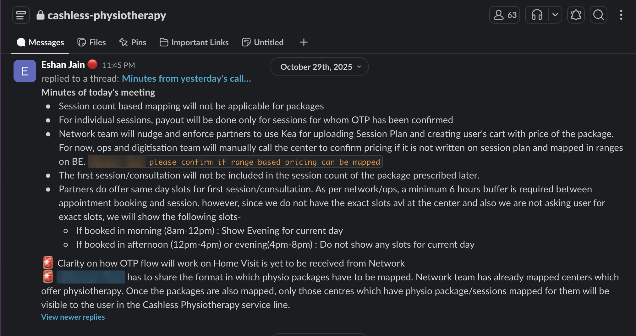
Multiple rounds of discussion followed. Our MD walked us through what clients were expecting. The in-house doctor team, explained how physiotherapy bookings typically work and what the clinical flow should look like. The network team, who had already been exploring partnerships, helped us understand the provider landscape - who we could partner with, what the market looked like from a physiotherapist's perspective.
On the basis of all this, I went deep into designing how the journey should work - finding the right sync between what the physiotherapist wants, what the doctor needs, what the user expects, and what the sponsor requires for compliance. We mapped the entire flow in Lucidchart and floated it across leadership and all stakeholders.
This alignment phase took a couple of months. Different versions, different iterations, constant pushback. That's normal. What I learned is that the scoping phase for a multi-stakeholder service line isn't a single meeting with a whiteboard - it's a sustained campaign of getting everyone to agree on what "the journey" even means.
Designing without a playbook
Once the flow was finalised on paper, we moved to the design team. I sat with our designer daily for close to a week. We looked at inspiration, studied how other players were approaching digital physiotherapy, and found something interesting — there was no aggregator in the market offering cashless physiotherapy as a benefit to sponsors or insurers. We were essentially a first mover.
A couple of standalone physiotherapy apps had a digital play, so we studied their UIs and flows. But their context was different — they were single-sided consumer apps, not multi-stakeholder platforms. We had to design from first principles.
The first iteration of the consumer app designs went through the same gauntlet — back to every stakeholder for review and approval. This cycle took another couple of months, with multiple iterations. Then came a demo with the MD & CEO, who liked the overall journey but wanted the UI to be more salesy — he wanted the interface itself to nudge users toward booking more sessions, rather than relying on the ops team to drive utilization.
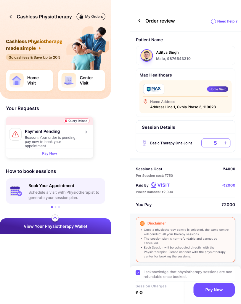
So we went back to the drawing board. Full design revamp. New screens from scratch. A journey that was more inviting, easier for the customer, with simpler operational flows. This was painful but it was the right call — the second version was meaningfully better.
The multi-interface build
Once designs were locked, we moved to engineering. Backend developers, Android developers, iOS developers, web developers - each needed to understand the full journey, not just their slice of it.
The build order mattered. Backend had to go first - APIs, database architecture, the session model, pricing logic, OTP verification for consultations. Only then could the mobile and web teams start building against real endpoints.
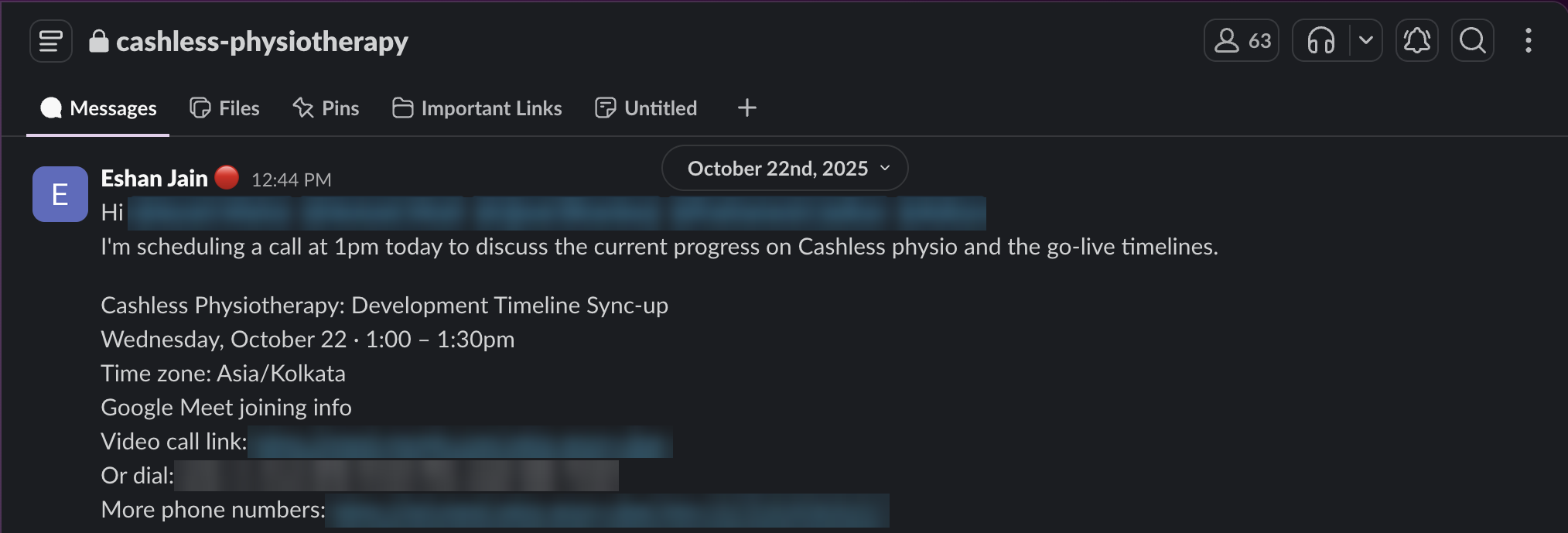
Meanwhile, I was simultaneously working on:
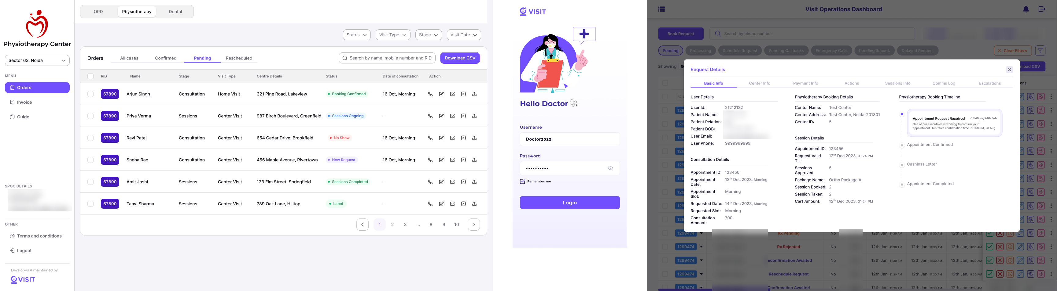
The partner dashboard (Kea) - where physiotherapy centres would accept orders, upload session plans, manage appointments, and raise invoices. This needed its own set of designs, its own set of stakeholder reviews, and its own onboarding guide.
The operations dashboard - where our internal team manages every order lifecycle, handles exceptions, and coordinates between users and partners.
The doctor panel - where our in-house doctors verify prescriptions and digitise them before the user can proceed to booking.
Network onboarding - working with the network team to map physiotherapy centres, their session pricing, available packages, and service areas. This involved a master price mapping sheet, partner-specific billing headers, and a phased onboarding plan.
Communication templates & amplitude events - every touchpoint in the user journey needed templated communications across email, SMS, and push notifications along with tracking events setup for us to analyse user behaviour.
The messy middle
Here's the part that doesn't make it into case studies: the messy middle.
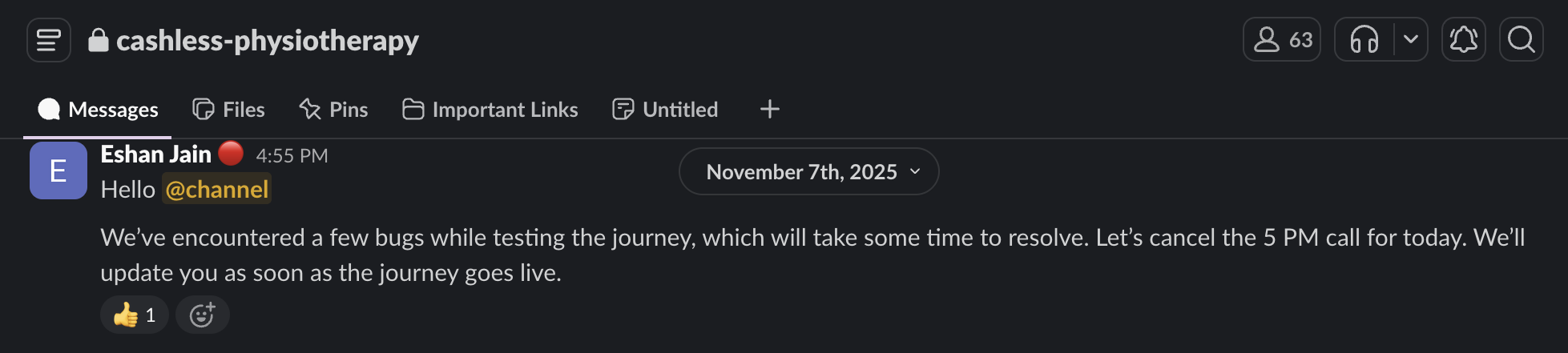
We encountered bugs while testing the journey. Calls got cancelled. Timelines slipped. There were days when the entire team was debugging auth token issues on iOS while simultaneously trying to finalise the pricing logic for a partner who needed to go live that week.
The ops team tested the journey and came back with a list of detailed feedback — everything from "the logo of the centre should appear alongside the name" to "the disclaimer on cancellation is not mentioned" to "during the centre selection stage, the amount to be paid was shown as zero." Each of these was a real usability issue that would have broken the experience if it shipped.
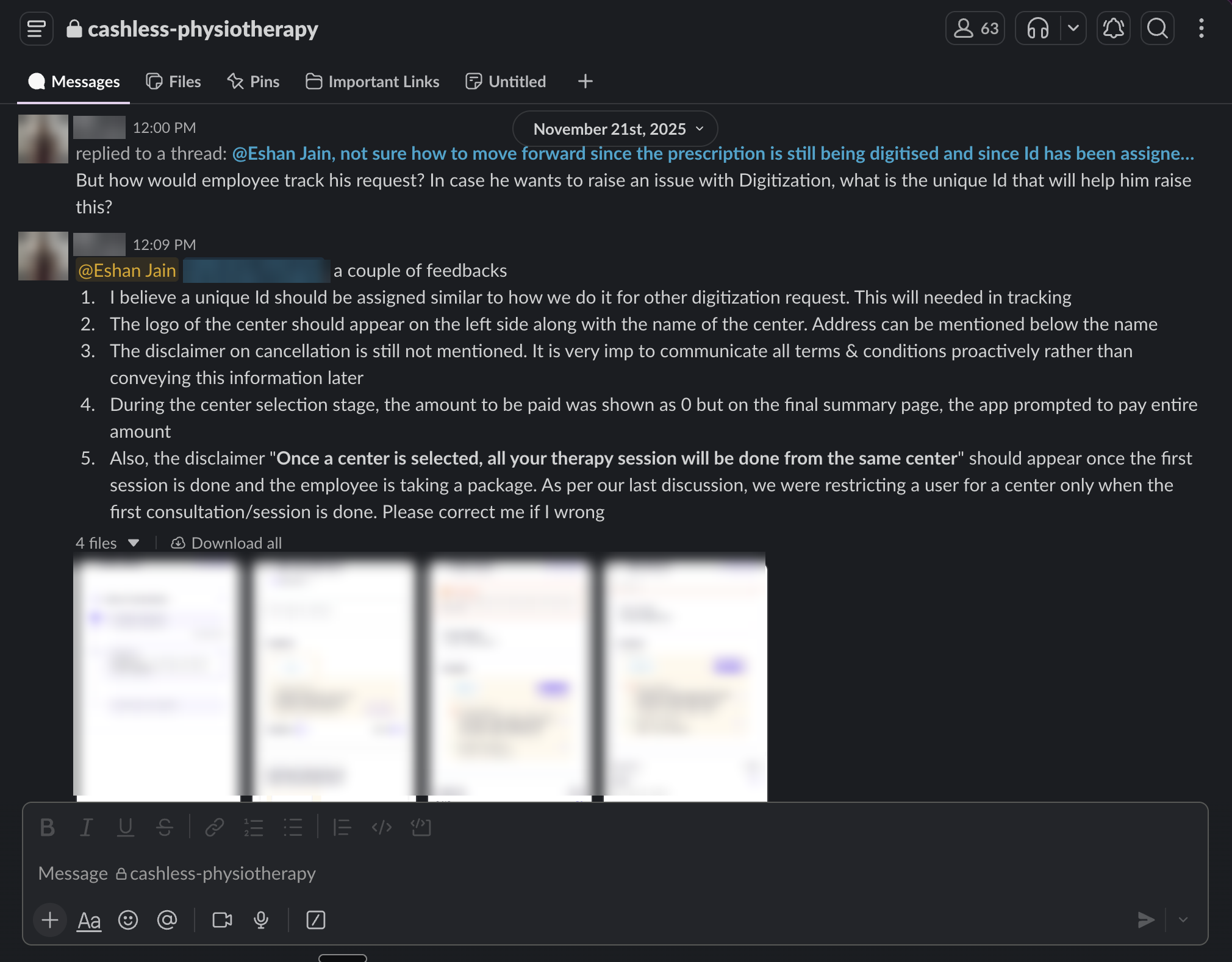
This is the phase where the PM's job shifts from designing the system to defending the quality bar. You're triaging bugs, prioritising what blocks launch versus what can ship in v1.1, coordinating across four engineering pods, and writing Amplitude event specs so that you can actually measure what's happening once users start flowing through.
Going live
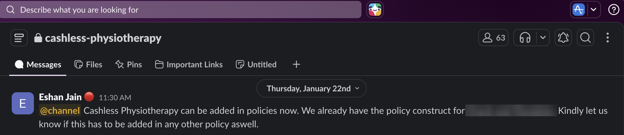
Cashless Physiotherapy went live on production for Android and iOS across several large corporate and insurance sponsors in early 2026. The web app followed shortly after once the remaining bug fixes were resolved.
What I took away
Alignment is the actual product work. The most time-intensive phase wasn't design or development — it was getting a dozen stakeholders to agree on what the journey should look like. That's not overhead; that is the job.
Multi-stakeholder products are a different sport. Designing for one user type is hard enough. Designing for five — each with competing priorities — requires you to hold the entire system in your head at all times. The user wants simplicity; the insurer wants documentation; the partner wants flexibility; the ops team wants control. Your job is to find the design that serves all of them without being a compromise for any of them.
Ship the ugly version. The first design we built was fine. The CEO's feedback to make it more engaging felt like a setback at the time, but the second version was better in every way. Sometimes going back to the drawing board isn't a failure — it's the process working as intended.
The messy middle is where the product gets made. The Slack channel for this project had hundreds of messages — session plan discussions, pricing debates, bug reports, partner onboarding questions, Figma links, meeting minutes. None of it was glamorous. All of it was necessary.
I'm proud of this one. Not because it was smooth — it was anything but. But because we built something that didn't exist in the market, across five interfaces, with a team that figured it out as we went.